Microsoft Windows Phone App
Case Study
Identified and documented Windows Phone Remote Desktop app product requirements. Worked cross functionally and prototyped user interactions and flows.
Team: I worked independently on this project.
Collaborated with: engineers, PMs, designers, researchers, users
Timeline: 12 weeks
I joined the Remote Desktop team as a Program Manager Intern to own the development of a new Windows Phone app, and to be the end user’s advocate throughout the process. I was responsible for understanding different types of users, their needs, and priorities in order to design a great experience for the Windows Phone Remote Desktop app.
Remote Desktop Protocol (RDP) is a technology that enables users to control another computer from their machine. You have probably seen it commonly used for tech support; but I soon discovered that RDP supports quite a wide range of use cases.
At the time, RDP apps already existed on Windows Phone (WP), iOS, and Android platforms - however, there was no official mobile app published by Microsoft. To be aligned with the company’s mobile push, it was imperative for the company to launch an exceptional Remote Desktop experience on WP.
RESEARCH
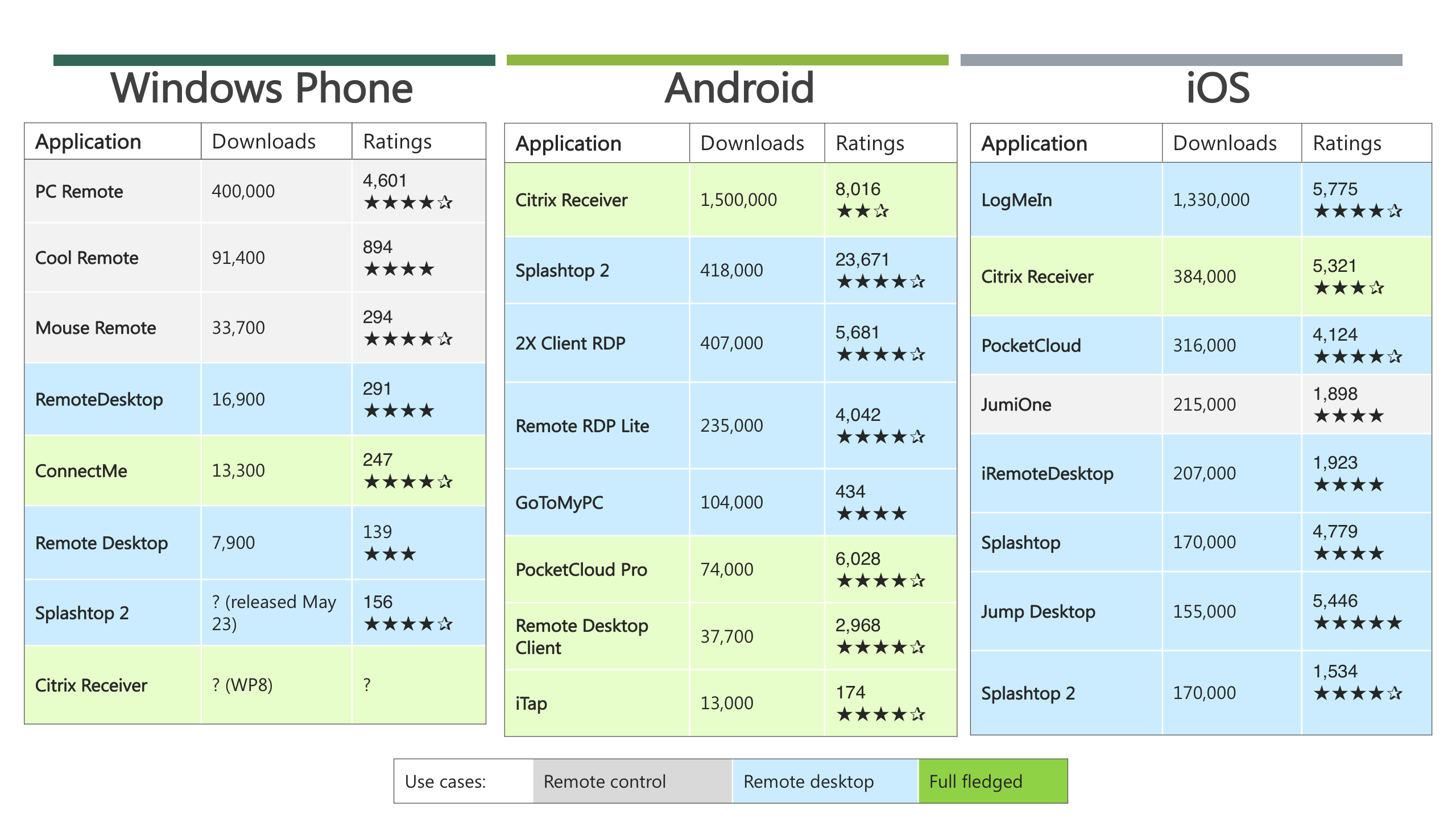
Competitive Landscape
I started off by evaluating 24 competitor apps on Windows Phone, Android, and iOS, including popular services like Splashtop, Citrix Receiver, LogMeIn, etc. I ranked them by download count and average user rating for each platform.
All the apps offered some type of remote functionality, however, a clear distinction emerged: some apps only had a mouse/touch interface to control their computer from afar (remote control), whereas other apps showed and allowed access to the desktop (remote desktop). I depicted these differences, along with app popularity and ratings in the graphic below.
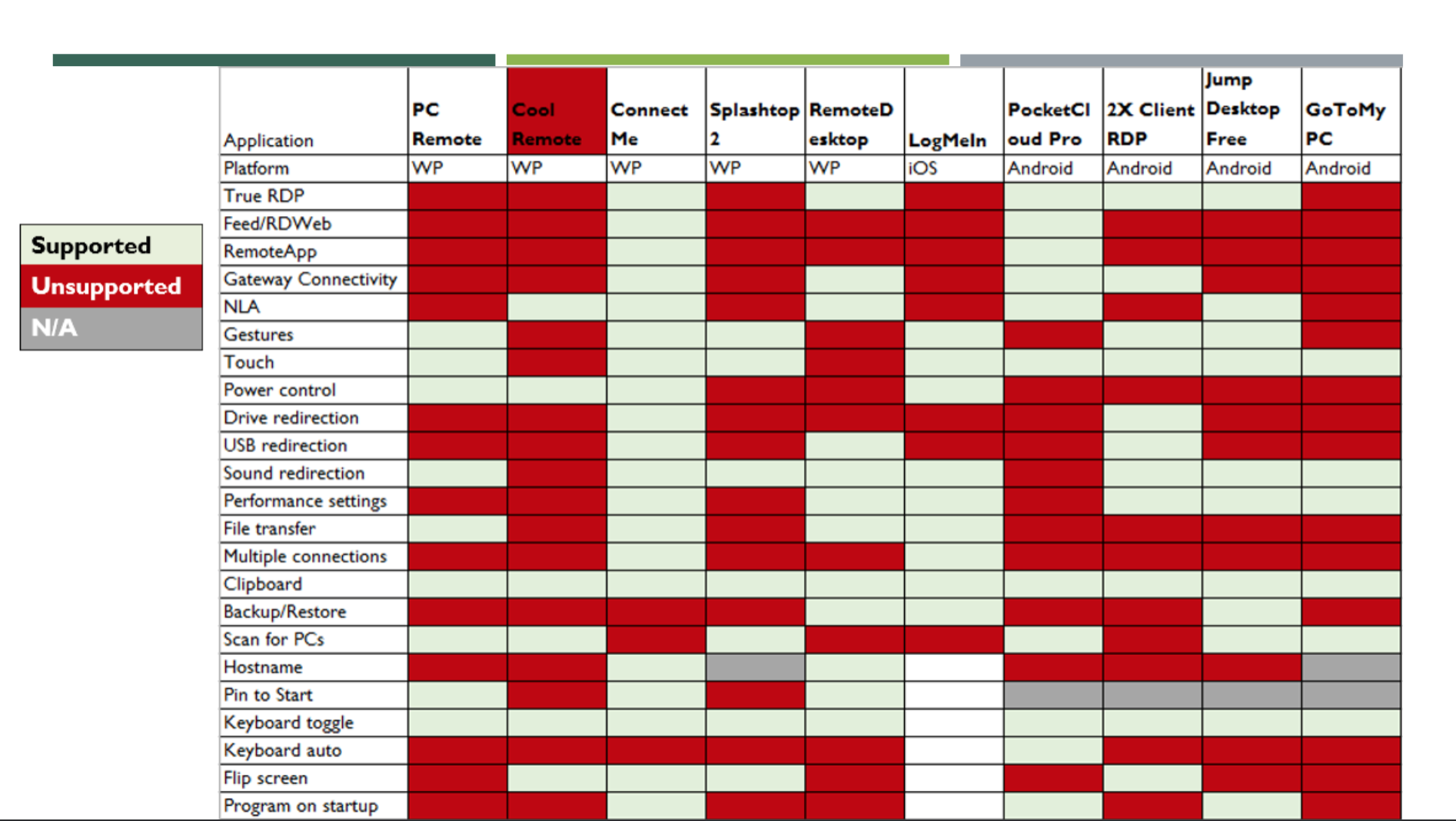
Competitive Analysis
Out of the 24 apps, I downloaded the 10 most popular ones to thoroughly evaluate their features and flows. I visually coded what apps offered specific features in a spreadsheet (below). From this chart, it was clear that the Remote Desktop app landscape is highly fragmented. The main commonalities included Gestures, Touch, Clipboard, Keyboard Toggling, Sound Redirection, and Performance Settings. I followed up with engineering to confirm that we can support the technical features; later on, I dove deeper into Gestures, Touch, and Keyboard Toggling interactions with the UX team.
Internal Ecosystem
After gathering external information, it was time to look inwards at what internal landscape the RDP app would be brought to life in. I read as many specs as I could get my hands on, for a more comprehensive understanding of Microsoft’s remote product offerings.
At the time, two of the team’s top OKRs were (1) to align with the Microsoft Metro design system, and (2) to move into the cloud space with Azure RemoteApp. I made sure to review the Metro framework, especially its design patterns and touch gestures.
Personas & Scenarios
From there, I read over 1,000 app store reviews across Android, iPhone, and Windows Phone platforms. I also interviewed a few internal users who frequently use Remote Desktop on their mobile phones. Two primary personas emerged from this exploration: Claire, the IT Administrator, and Phil, an employee on-the-go.
I developed a few scenarios for each persona, in order to capture a fuller picture of how their individual personalities shape their usage of RDP.
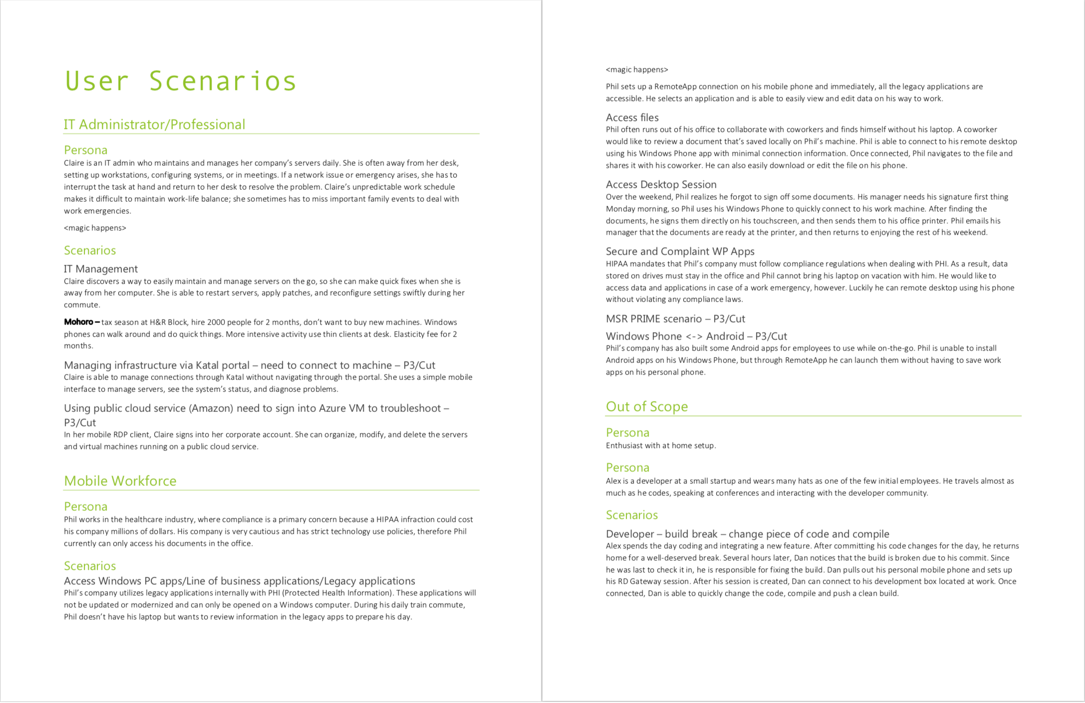
Use Cases
Through harnessing all of the qualitative data I described above, I identified 29 use cases. By reading previous RDP specifications, I had a sense of the prioritization of my use cases. I reached out to other PMs on the team to confirm my ordering of use cases into P0-P3 and out-of-scope levels of importance.
Prioritization of use cases was especially critical in my process. My challenge was to decide which features we could support on a mobile device. The original RDP application was very powerful and used by a wide audience; it offered a slew of custom settings and integrations. The mobile app couldn’t be as fully fledged due to its mobile form factor - constraints like processing power, a smaller screen, etc. meant that the Windows Phone app would be a watered down version of the desktop application.
Data Analysis
After reading the 1,000 app store reviews, I exported them into a spreadsheet to quantitatively analyze the data. I wanted to uncover the most prevalent pain points, so I generated a word frequency list to see what users mention the most often. Common words like “the”, “and”, “to”, etc. were filtered out.
This method surfaced a series of pain points in existing RDP apps that I illustrate in the Design section below.
In the comments, I noticed that a rampant request was for access to non-standard keys like Ctrl, Tab, Arrow keys, etc. that were not available in the built-in Windows Phone keyboard. This was puzzling to me - why someone need those keys on a mobile phone? To find out, I set up a survey to reveal the reasoning behind this user need.
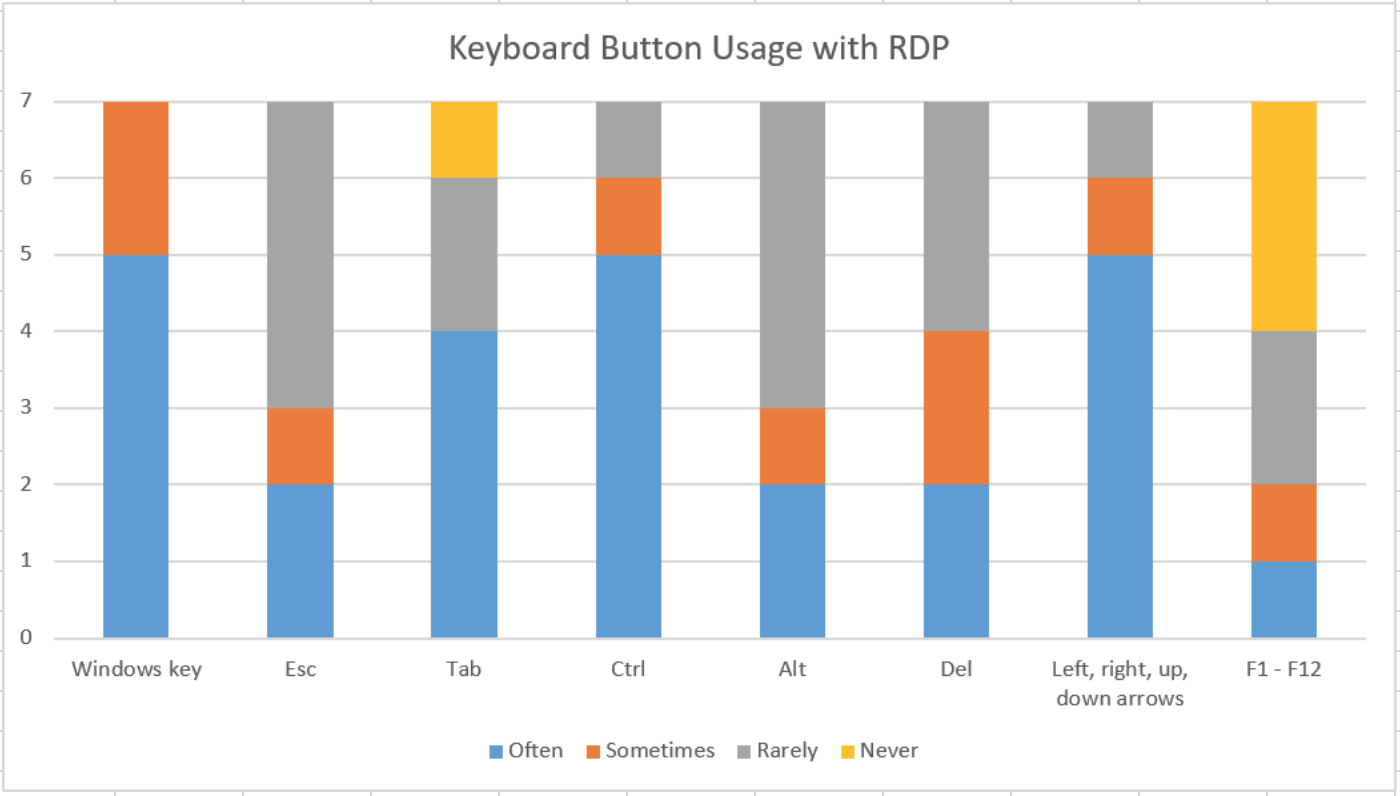
Survey on Keyboard Button Usage
I conducted a quick survey with 40 RDP users; the goal was to identify what keys they press most often when connecting to a remote machine, and for what reasons.
It turned out that a significant amount of users were power users who frequently program their own keyboard shortcuts. For example, one power user programmed Shift+Ctrl+3 to perform three different tasks at once. It was a very clever way to maximize productivity using RDP. The most frequently utilized keys were the Windows key, Ctrl, Tab, and Arrow keys. Below, you can see the 7 responses out of 40 surveys.
I dive deeper into an exploration of how non-standard keys can be accessible in the Design section below.
RESEARCH TAKEAWAYS
Recommendations
My analysis of the qualitative and quantitative data around RDP mobile apps culminated in the following recommendations for the design phase of this project.
- Maximize visibility: Five out of ten existing apps waste screen space by not supporting screen rotation from portrait to landscape mode. Avoid permanently fixed toolbars and buttons as they can block access to important controls.
- Swift access: Users should be able to connect quickly; barriers to connecting cause frustration and confusion. The top complaint is a laggy user experience.
- Simplicity: Limit the onboarding to a few visual instructions rather than lengthy descriptions. Minimize number of custom settings in the set-up flow and offer fewer options than desktop RDP; too many customizations slow down the task flow.
Future Improvements
There are more accurate methods to capture which keys are most frequently utilized with Remote Desktop. Next time, I would set up keystroke logging on users’ machines and then determine which keys are truly crucial quantitatively.
DESIGN
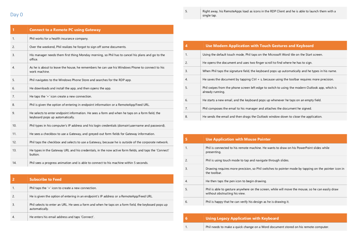
Generating a word frequency list from the 1,000 reviews surfaced five areas of friction in existing RDP apps: (1) browsing the file system, (2) navigating windows, (3) accessing the keyboard, (4) accessing buttons/app bar, and (5) ambiguous touch gestures. I decided to do a deep dive into each of these interactions. I ideated and prototyped UIs to show the team how these areas could be improved.
For each prototype, I requested feedback from UX researchers, designers, engineers, and other PMs. Incorporating their insights into my research, I iterated on the designs to create the UIs you see below.
File System Browser
With existing RDP apps, it is incredibly difficult to navigate a remote PC’s file system. Imagine a desktop PC’s screen - usually more than 17 inches - scaled down to a 5.5 inch phone screen. The user must be able to utilize the desktop UI, which has small touch targets, and this often results inaccurate selections.
Instead, I proposed allowing the user to directly navigate the file system in a mobile interface. Working with engineers, we could extrapolate that data to an interface with larger touchpoints.
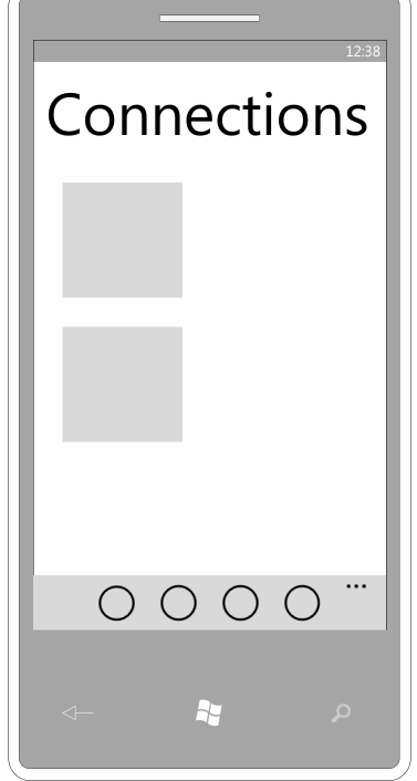
In the animation, the user uses the long press gesture on a particular connection to access the PC’s file structure.
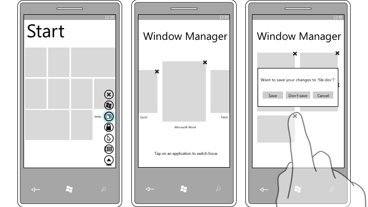
Navigating & Closing Windows
Like accessing the remote PC’s filesystem, this task is similarly challenging in that it involves very small touch targets that can lead to erroneous operations. Switching between windows and closing them is such a common task flow - I wanted to simplify it, especially since I had confirmation that it was technically feasible.
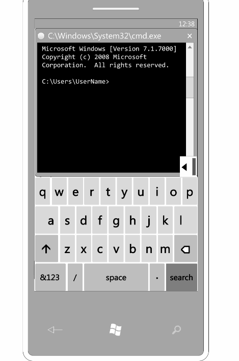
Keyboard
Remember the survey I conducted on non-standard keyboard button usage? The results made it clear that we must support the subgroup of power users who utilize the Windows key, Ctrl, Alt, Tab, etc. regularly.
Ideally, these additional keys will be easily accessible from the built-in keyboard, but also hideable when not needed. I recommended the design below.
Another design challenge around the keyboard was figuring out a way to seamlessly open and close it. A prevailing complaint in the app store reviews was that accessing the keyboard was tenuous.
In Android, when the keyboard is opened, there is a down arrow in the bottom bar that closes the keyboard when tapped. This bottom bar didn’t exist in the Windows Phone design pattern, so I needed to come up with alternative solutions. As the keyboard must be accessed by a button, my exploration of these designs are included in the next section.
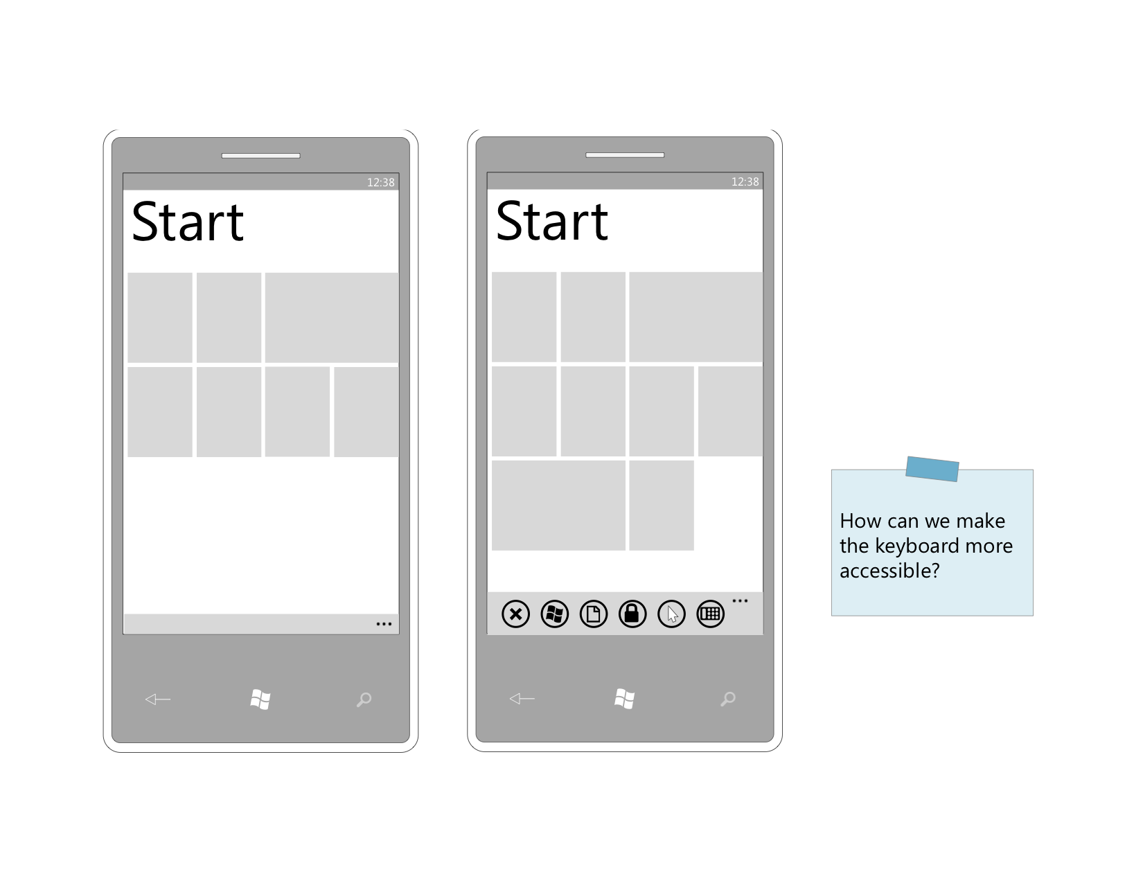
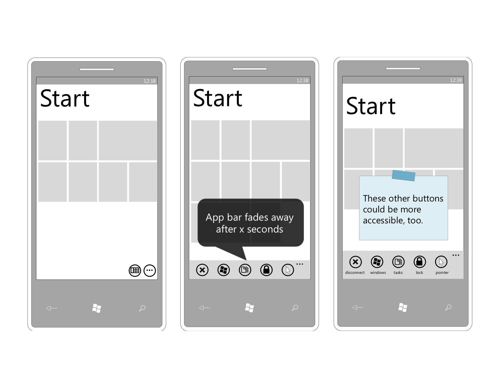
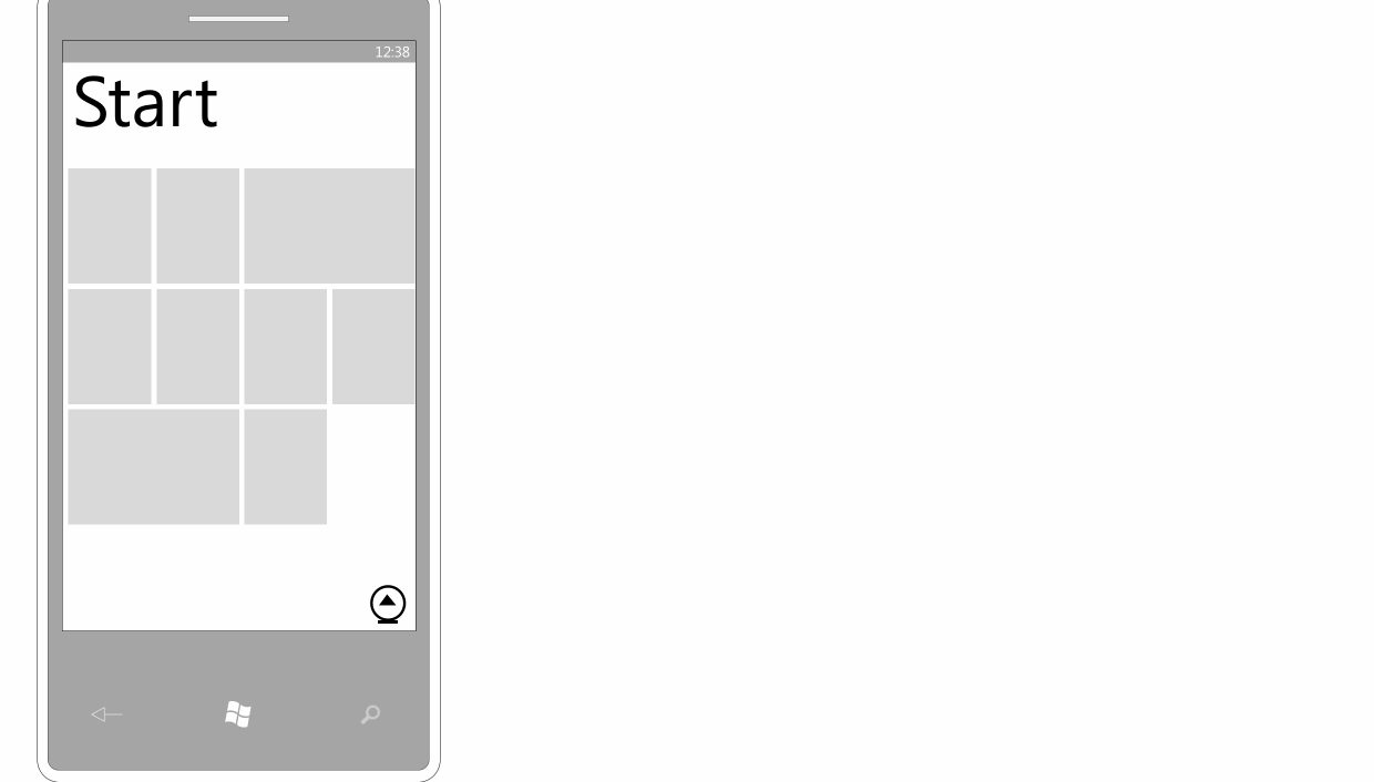
App Bar & Buttons
It was important to ideate interactions around buttons because that will be the primary way users complete tasks in the RDP app. My main goal was to make the buttons accessible,but not fixed on the screen taking up precious real estate. Also, the buttons should be labeled and not ambiguous so users understand what actions are available.
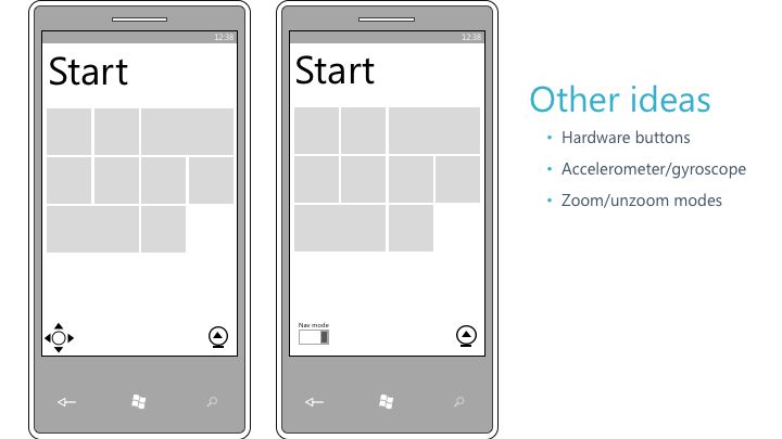
Gesture Disambiguation
The most complex design problem that I faced in this project involved touch gestures. There was a lot of ambiguity in determining which gestures would map to which operations. This was caused by the fact that a mobile Remote Desktop app has a desktop interface embedded in a phone’s interface.
For instance, how would we delineate between scrolling and panning? The touch gesture is the same for both, so the user must have a way to express his or herintent. Below are two designs that would map to an understandable mental model - the user could toggle navigation mode on and off to avoid confusion. Other possibilities I considered included using the phone’s hardware (gyroscope) to pan or scroll.
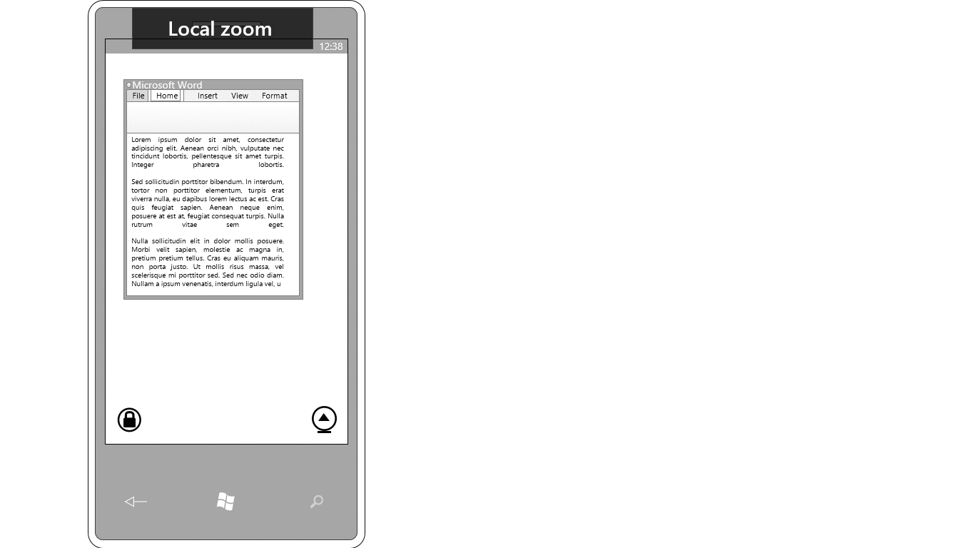
Distinguishing between a remote pinch-to-zoom versus a local pinch-to-zoom was equally perplexing. How would the user communicate whether they wanted to zoom the entire desktop, or just the contents of one window on their desktop?
Recommendations
My analysis of the qualitative and quantitative data around RDP mobile apps culminated in the following recommendations for the design phase of this project.
- Maximize visibility: Five out of ten existing apps waste screen space by not supporting screen rotation from portrait to landscape mode. Avoid permanently fixed toolbars and buttons as they can block access to important controls.
- Swift access: Users should be able to connect quickly; barriers to connecting cause frustration and confusion. The top complaint is a laggy user experience.
- Simplicity: Limit the onboarding to a few visual instructions rather than lengthy descriptions. Minimize number of custom settings in the set-up flow and offer fewer options than desktop RDP; too many customizations slow down the task flow.
Future Improvements
There are more accurate methods to capture which keys are most frequently utilized with Remote Desktop. Next time, I would set up keystroke logging on users’ machines and then determine which keys are truly crucial quantitatively.
Generating a word frequency list from the 1,000 reviews surfaced five areas of friction in existing RDP apps: (1) browsing the file system, (2) navigating windows, (3) accessing the keyboard, (4) accessing buttons/app bar, and (5) ambiguous touch gestures. I decided to do a deep dive into each of these interactions. I ideated and prototyped UIs to show the team how these areas could be improved.
For each prototype, I requested feedback from UX researchers, designers, engineers, and other PMs. Incorporating their insights into my research, I iterated on the designs to create the UIs you see below.
File System Browser
With existing RDP apps, it is incredibly difficult to navigate a remote PC’s file system. Imagine a desktop PC’s screen - usually more than 17 inches - scaled down to a 5.5 inch phone screen. The user must be able to utilize the desktop UI, which has small touch targets, and this often results inaccurate selections.
Instead, I proposed allowing the user to directly navigate the file system in a mobile interface. Working with engineers, we could extrapolate that data to an interface with larger touchpoints.
In the animation, the user uses the long press gesture on a particular connection to access the PC’s file structure.
Navigating & Closing Windows
Like accessing the remote PC’s filesystem, this task is similarly challenging in that it involves very small touch targets that can lead to erroneous operations. Switching between windows and closing them is such a common task flow - I wanted to simplify it, especially since I had confirmation that it was technically feasible.
Keyboard
Remember the survey I conducted on non-standard keyboard button usage? The results made it clear that we must support the subgroup of power users who utilize the Windows key, Ctrl, Alt, Tab, etc. regularly.
Ideally, these additional keys will be easily accessible from the built-in keyboard, but also hideable when not needed. I recommended the design below.
Another design challenge around the keyboard was figuring out a way to seamlessly open and close it. A prevailing complaint in the app store reviews was that accessing the keyboard was tenuous.
In Android, when the keyboard is opened, there is a down arrow in the bottom bar that closes the keyboard when tapped. This bottom bar didn’t exist in the Windows Phone design pattern, so I needed to come up with alternative solutions. As the keyboard must be accessed by a button, my exploration of these designs are included in the next section.
App Bar & Buttons
It was important to ideate interactions around buttons because that will be the primary way users complete tasks in the RDP app. My main goal was to make the buttons accessible,but not fixed on the screen taking up precious real estate. Also, the buttons should be labeled and not ambiguous so users understand what actions are available.
Gesture Disambiguation
The most complex design problem that I faced in this project involved touch gestures. There was a lot of ambiguity in determining which gestures would map to which operations. This was caused by the fact that a mobile Remote Desktop app has a desktop interface embedded in a phone’s interface.
For instance, how would we delineate between scrolling and panning? The touch gesture is the same for both, so the user must have a way to express his or herintent. Below are two designs that would map to an understandable mental model - the user could toggle navigation mode on and off to avoid confusion. Other possibilities I considered included using the phone’s hardware (gyroscope) to pan or scroll.
Distinguishing between a remote pinch-to-zoom versus a local pinch-to-zoom was equally perplexing. How would the user communicate whether they wanted to zoom the entire desktop, or just the contents of one window on their desktop?